16:59
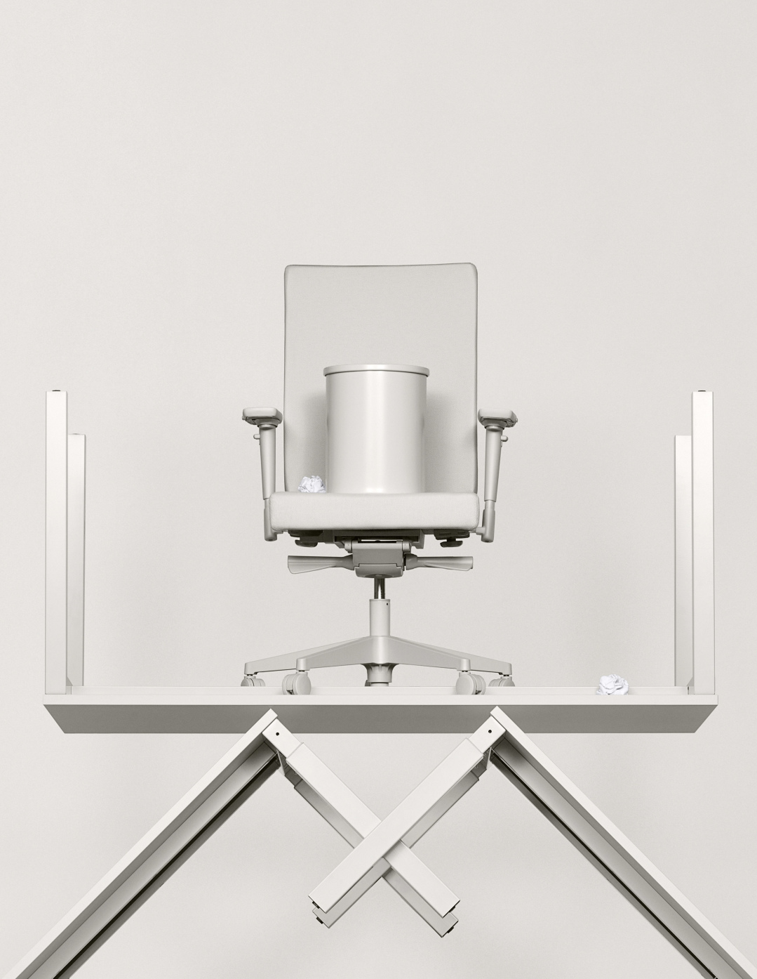
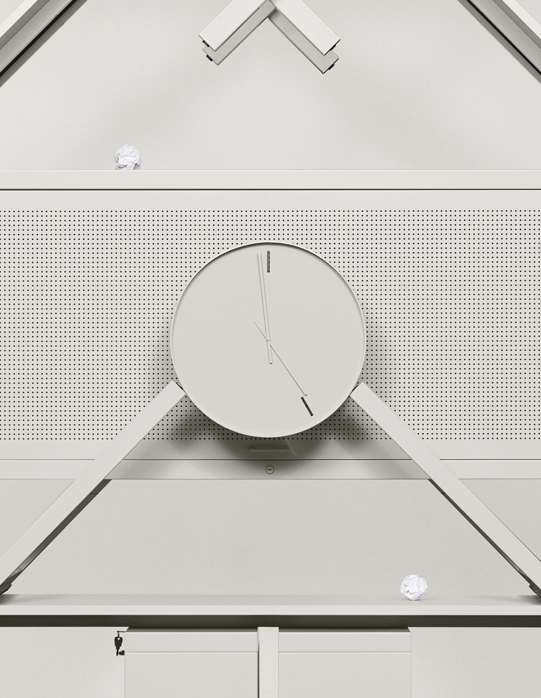
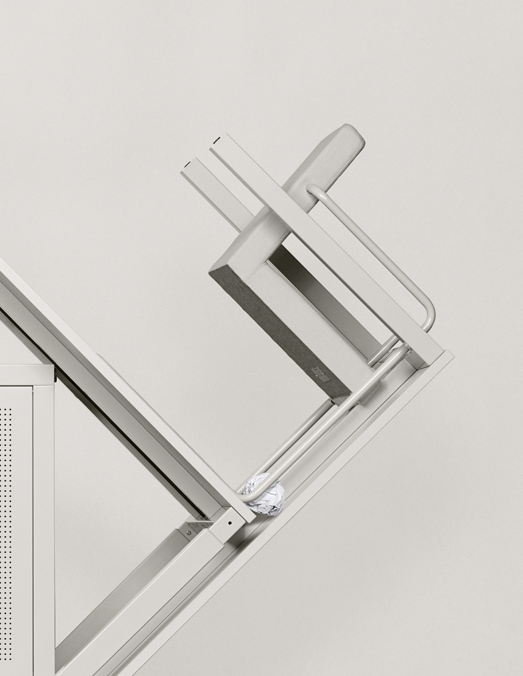
We’ve been attracted for the promotion of Boring Collection, a series of grey office furniture. Boring Collection was conceived by Lensvelt/Space Encounters as a comment on the “ugly” appearance of affordable contract furniture and the distracting designs being added to some workplaces in the wake of the Google office. We can totally relate to the idea that furniture should not demand too much attention. For this project, we worked with the most iconic gesture of boredom: the attempt to throw a ball of crumpled paper into the trashcan until the clock turns five. In the film office people steal the scene even though they are surrounded by the designs of Boring Collection. Just like the architects intended.
For the still campaign we stacked the furniture pieces on top of each other in a shape inspired by Ettore Sottsass’ Carlton bookcase, the most ’un’boring furniture piece we could imagine.
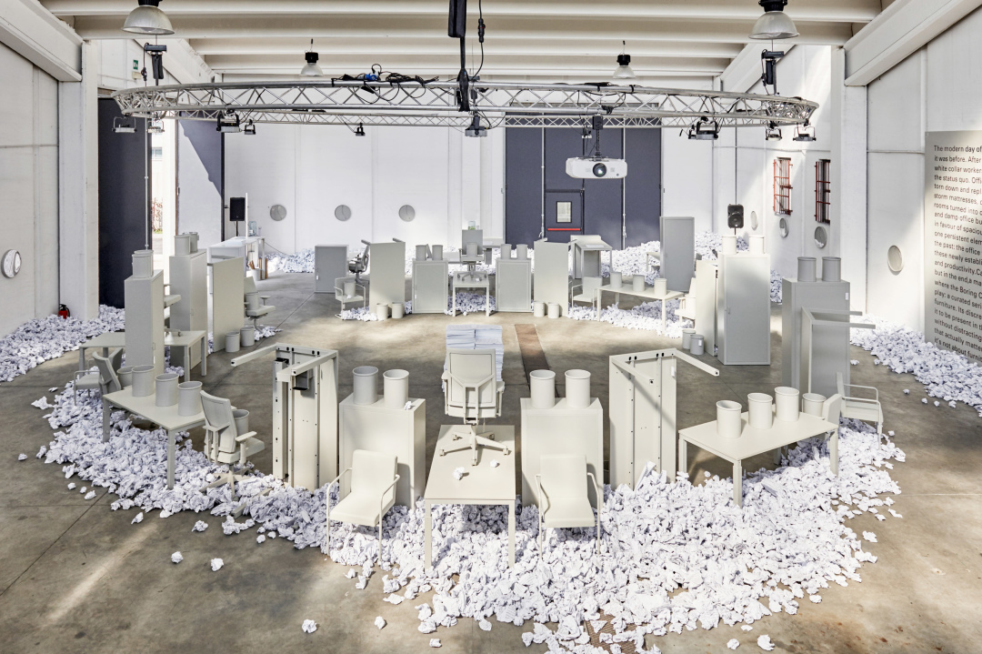
Lernert & Sander’s concept will be repeated for the furniture collection’s debut at this year’s Milan design week with an installation at Ventura Lambrate. The furniture will be placed in a clock-like formation, and will stand in an artificial landscape of 150,000 paper balls made from leaflets about the collection.
Commissioned by Lensvelt and Space Encounters
Creative Direction: Lernert & Sander
Executive Producer: Maarten Le Roy
Producer: Brechje Depourcq
Production Assistant: Dennis Vanderbroeck
Design assistant: Casper Braat
Light: Gerard Stam
Grip: Mike Laureys
Art Director: Egbert and Titus Steenwinkel
Editor: Simone Rau
Online & grading: Charles De Meyer
Music & Soundscape: Diederik Idenburg (M-OST)
Extras: Tjade Bouma, Loek de Bakker, Milou van Duijnhoven, Rozanne de Bont, Veronique de Koning, Pietro Kruithof, Erdem Gesmiroglu, Lotte Driessen, Wouter Dullaert
Boring Collection won the Milano Design Award 2016 for the best presentation concept during Salone del Mobile 2016.

